Graphics in R
Plotting data
Plotting data is a good way to evaluate data. Not only after analysis but also during and prior to analysis to get a 'feel' for the data. For example to see the general behavior of the data, whether there are outliers, whether the data clusters, etc. Plots are also useful for diagnostic purposes during model development and indeed final plots for presenting the data. For the R code the build in databases are used as much as possible so it can easily be copied and tested in R. Note that the required libraries are present.
Boxplot
A boxplot can be easily created in R by using the 'boxplot()' function. Choose the continuous and categorical column and specify the database. It is possible to set the colors, change labels, etc.
boxplot(Sepal.Width~Species, data=iris)

boxplot(Sepal.Width~Species, data=iris, col = c("lightblue","lightgreen","red"),
        ylab="The sepal width", names=c("name1","name2","name3"))
Note: When plotting boxplots with ggplot make sure to use 'coord_cartesian()' to change axis. Setting limits on the coordinate system will zoom the plot (like you're looking at it with a magnifying glass), and will not change the underlying data like setting limits on a scale will.
GGPlot2: Scatterplot
Import the library. The 'gglot()' initializes ggplot2 to create a plot. This can contain settings for everything that follows. In this case the data 'ggplot(data=...)' just 'ggplot(...)'. After this step the type of plot is chosen. In this case a scatterplot is created ('+geom_point()'). The 'x' and 'y' variables need to be mapped/set. This is done within 'mapping=aes(x=.., y=..)' or short 'aes(..,..)'. This mapping can also be done within 'gglot(data, aes())'. In the latter case, all following plots added to ggplot are using that database with those variables.
library(ggplot2)

ggplot(data=iris)+geom_point(aes(x=Sepal.Width, y= Sepal.Length))
Plot layout
Plots can be easily modified by adding arguments to the plot. Standard themes are the quickest option.
ggplot(iris) +
	geom_point(aes(Sepal.Width,Sepal.Length)) +
	theme_classic()
A scatterplot with explicit settings to modify the layout. Stratifications can easily be made visible with 'color' or 'col' (for continuous and categorical variables), or 'shape' (categorical) argument in aes.
ggplot(iris)+geom_point(aes(Sepal.Width, Sepal.Length, col = Species, shape= Species), size=2) +
  theme(axis.title.x = element_text(size=12, face='bold'),
      axis.title.y = element_text(size=12, face='bold'),
      axis.line = element_line(size = 0.5, colour = "black"),
      axis.text.x = element_text(size = 10, face='bold', margin = margin(1,1,10,1)),
      axis.text.y = element_text(size = 10, face='bold', margin = margin(1,3,1,15)),
      panel.grid.major = element_line(size = 0.05, linetype = 'solid', colour = "white"),
      panel.grid.minor = element_line(size = 0.01, linetype = 'solid',colour = "white"),
      panel.background = element_rect(size = 0.5, linetype = 'solid',colour = "white", fill='white'),
      legend.box.background = element_rect(linetype = 'solid'),
      legend.box.margin = margin(3, 3, 3, 3),
      plot.background = element_rect(fill='grey'),
      plot.margin = unit(c(0.5,0.5,0.5,0.5), "cm")) +
	labs(x="Sepal width", y="Sepal length")
Combine/layer plots
Using '+' enables adding or modifying the plot. For example an additional plot can be added on top of the first. Here a smoothed cond means plot is added to the scatterplot.
ggplot(iris)+
	geom_point(aes(Sepal.Width, Sepal.Length, col=Species, shape=Species)) +
 	geom_smooth(aes(Sepal.Width, Sepal.Length), method = loess) +
 	facet_wrap(~Species)
First a scatterplot is created using geom_point with colors and shape of the points to stratify the data by the variable 'Species'. Subsequently a smoothed conditional means plot is added on top of the scatterplot. After that the plot is divided into three plots based on 'Species' by using using 'facet_wrap()' Creating the following result:
Axis text Adding things like symbols, superscript and subscript to titles and lables can be done using 'expression' or 'bquote'. Using 'expression':
ggplot(db)+geom_point(aes(Conc,TIME)) +
  labs(x = expression(paste(bold("text x "),alpha['sub']^-2,
                            italic(' italic'), integral(e^x*pi*sqrt(frac(2,3)), -infinity, x))))
Using 'bquote':
ggplot(db)+geom_point(aes(Conc,TIME)) +
  labs(x = bquote(bold('text x') ~alpha['sub']^-2
                  ~italic('italic') ~integral(~e^x ~pi ~sqrt(frac(2,3)), -infinity,x)))
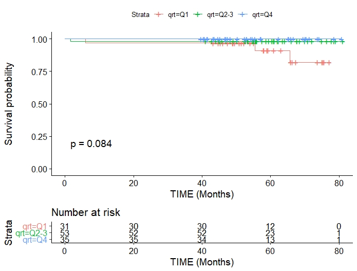
Kaplan-Meier plot
library(tidyverse)
library(survival)
library(survminer)

# time = time to death or censoring
# death = status death or alive (1,0)

survival <- events %>% select(ID, time, death, group)

mySurv <- Surv(time=survival$time, event=survival$death)
myfit <- survfit(mySurv ~ survival$group)

fit1 <- survfit(Surv(time, death) ~ group, data = survival)

ggsurvplot(fit1, pval = TRUE, conf.int = F, risk.table = TRUE)

3D plots
Several packages are available to plot 3D graphs. A straight forward package is scatterplot3D This is well explained here. An alternative is 'rgl' with 'car':
library(lattice)
library(rgl)
library(car)

scatter3d(bb$CP,bb$B,bb$AGE,type='p',size = 4,surface=T, fit ='smooth',
	sphere.size = 1.5, residuals = F, point.col = 'black',
          xlab='Prednisolone concentration', ylab='Fraction bound',
          zlab = 'Age (y)', axis.col = c('black','black','black'), axis.ticks = F)
aspect3d(1,1,1)
This uses the packages 'rgl' and 'car' (car is a package not a dataset). It has several options to represent the data and fit planes.